Finding the right balance
Often when I get approached for a rebrand the customer has a pretty good idea of what they need. They’ve got a clear idea of what their business is and what they stand for. In those cases, it’s just up to me to critically analyse if that’s the right direction, and provide some guidance and some ideas that they hadn’t thought of yet.
That wasn’t the case with this project. There were no concrete business goals, and their organization just kind of… existed. Not that it was suffering – daycare slots were booked out for months. But an organization can suffer long-term when they lack a vision of who they are and what they stand for. Just because there’s no good competition today doesn’t mean there won’t be any tomorrow.
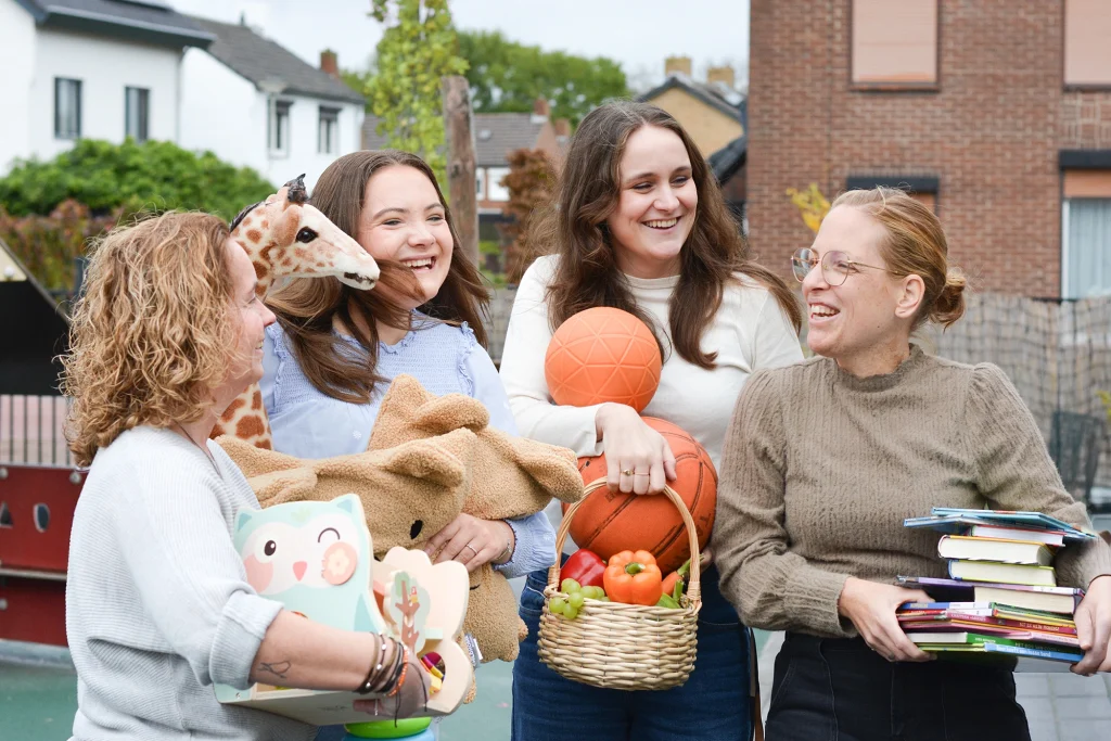
After a thorough analysis of policy, the competitive environment, workshops and chats with employees and customers, a clearer picture started to emerge. It all came down to making sure kids felt at home. Providing a warm, safe environment where kids have the space to grow.
Yet on the other hand, making sure things stay safe for everyone requires rules, structure and clear policy. There’s a tension between those two aspects – a warm environment with clear rules – that I found interesting. That tension became the inspiration for the strategic platform.
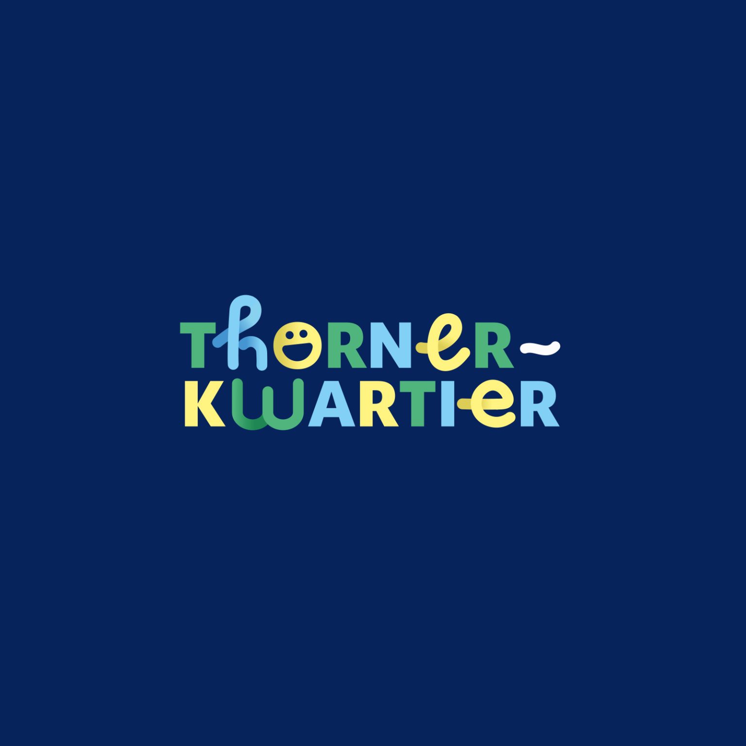
“A strong team – and soft pillows.” (it works better in Dutch, trust me)
This also provided a good lead for the direction of the design. Something soft and flexible on the one hand, and clear and professional on the other. It’s strong, but you can mold and shape it. Like clay. After creating and presenting several possible designs, we settled on the one below.
A key objective was to make the design child-friendly, but not childish. Striking that balance between something fun, and something professional. Also, to keep the color palette gender neutral.
While working on the design, in a separate workflow, we’d been doing the concept and wireframes for a new website. We managed to bring it down from 47 pages to just 6, with a clearer information structure and a brand new look.
Initial reactions from staff and customers have been overwhelmingly positive. Thornerkwartier has gone from an abstract collection of employees and rooms, to something which has a face and an identity.