Designing the invisible
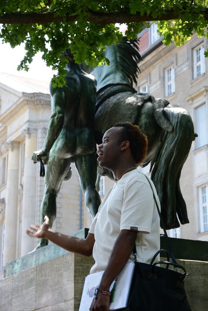
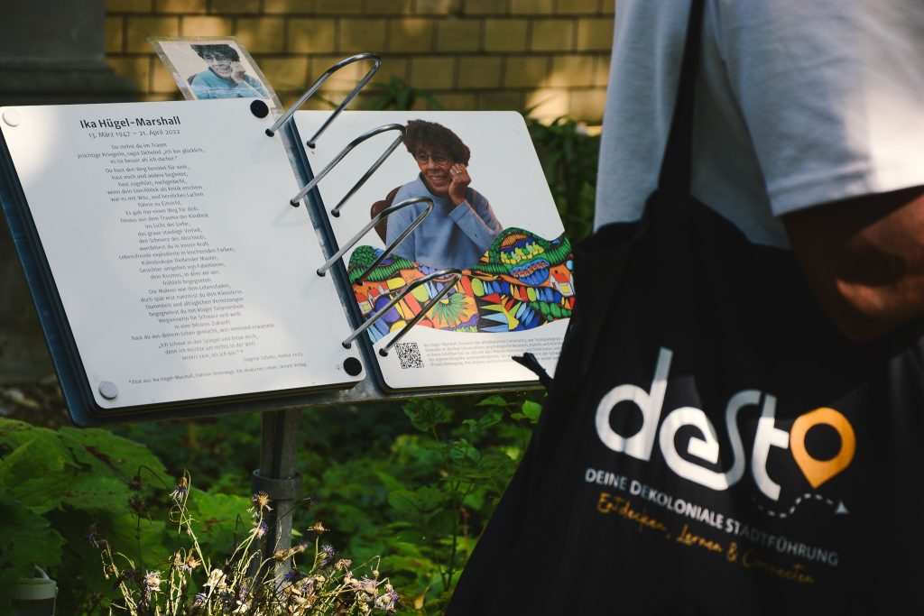
The traces and scars left by European and German colonialism are often hidden in plain sight. Sometimes, it’s a street sign bearing the name of someone who committed atrocities. Or an innocent looking sculpture in the corner of a park. Sometimes, it’s woven into the very fabric of our societies. Though the signs are subtle, its effects are not.
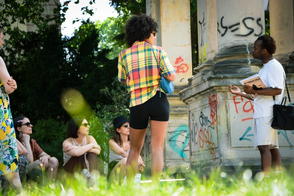
The design for this project, then, needed to make those things visible and perhaps even tangible. One of the challenges was that visually there’s not always a lot to see on these tours. It’s the stories told by the tour guides that bring the history to life.

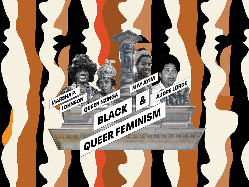
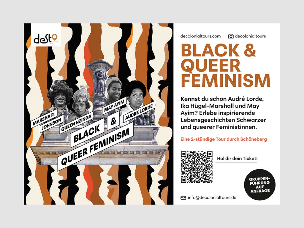
By combining African design patterns with historic places, people and events, each of the different tours gets its own unique identity. It immediately provides some hints on what topics users can expect on each tour. They’re bold and colorful to draw people’s attention. Keywords and names provide an extra layer of information.
The color palet uses the muted earth tones we find in the patterns. The site itself uses a minimal design to balance out the ‘loudness’ of the visuals themselves.
Digital communication materials expand on the content and provides further context.
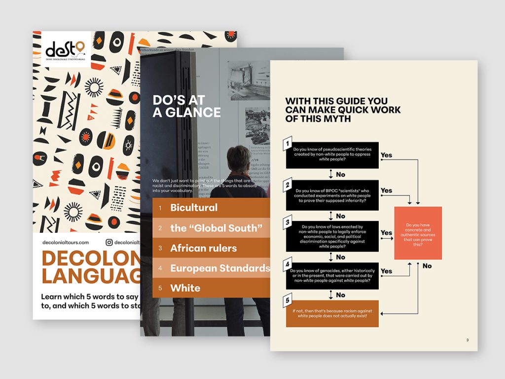
The design also works well on folders, flyers and billboards, standing out from the competitors.
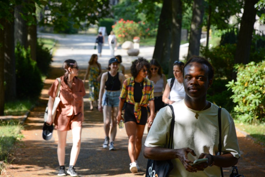
During one of the tours, I joined to take some pictures to add to the page.